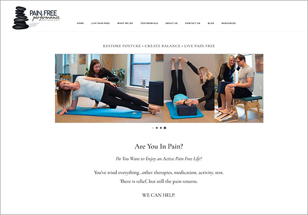
When my long-time client, Pain Free Performance, contacted me and asked if I could redesign their website to be one of those scrolling-style sites, I said “sure”. That style of site has become popular, as everything online shifts to accommodate the mobile experience. I had created a website for Pain Free 6 years prior, but as I say, website years and human years are a 10:1 ration, so their 2012 site was about 60 years old! I do think it is important for businesses to keep their web presence up to date visually, particularly if they are marketing to consumers. Website design styles change rapidly, and you can tell when a website starts to look dated. On the other hand, it is not necessary to redesign your site every year or two just because you are tired of looking at it.
Quality Photography Matters
As we began the development of the project, the owner wanted to have new photos, especially since their studio had had a make-over since our last time building their website. I always counsel my clients to get good professional photos for their website and other marketing materials. As ubiquitous as cell phone photography is, and as tempting as it is to just shoot some photographs on your own phone, I don’t recommend it. Having a professional photographer who can control the lighting and understands photo composition makes a huge difference in the look and feel of a website. The other thing I counsel is to coordinate the colors of the clothing of the people being photographed, so it is compatible with the colors of the space, and the colors of the website. So Pain Free Performance did use a professional photographer, and they got some really nice new shots showing their therapists working with clients, as well as individual portraits of their staff. We used some of the best shots to create a nice image slider in first panel of the site.
Tell Your Story
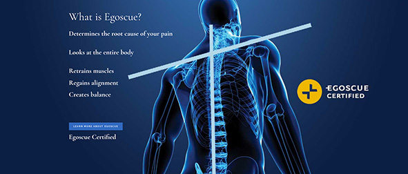
The nice thing about this style of site, is that each panel gets to tell part of the story. The hard thing is figuring out exactly how to break that down into panels and move the viewer visually through the sections. Although this home page changed completely from their previous site, most of the rich informative content on the interior pages of the site remained—it just is now placed in a refreshed container.
Website projects are always collaborative efforts. Working with my clients’ creativity and their ideas always improves the end result. I am very pleased with how this site turned out. It has given Pain Free Performance a fresh new look to their site and they have received many compliments. They were kind enough to even post a Google Review for me:
“Elizabeth is amazing! She just finished updating our Pain Free Performance website and we couldn’t be more pleased. Her expertise and direction have been invaluable as we strive to provide the best on line access to information about our services to the community. Her knowledge of design, color, content and technology while interpreting who we are is incredible. Elizabeth is a pleasure to work with and has become a friend to us as well as our expert guide to our web presence.” —Cindy Meyers, Pain Free Performance.

